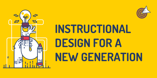
I enjoyed experimenting with Canva for week 5’s topic and focus; design principles for multimedia presentations. In the past couple of weeks of learning interactive and multimedia learning, it’s evident that proper visual aids and information for online learning can make or break your audience’s engagement in what you’re trying to teach them. I have been following and learning Mayer’s principles through Canva, a graphic design tool that works to simplify the digital design process. The platform provides tools to create beautiful and intricate work for everyone, from social media images, videos and gifts to posters, websites, multimedia presentations, and more. It’s a valuable tool for helping you level up your design skills, even if you’re just starting. I’ve used Canva in the past to design an infographic, but I never had the creative freedom to choose any topic and make it my own, especially with the new knowledge I’ve learned from weeks 5 and 6. In my experience as a student, I was never taught the rules and concepts of instructional design as educators expected students to know how to deliver the products through multimedia work properly. Merrill’s delivery on instructional design clearly showed me that it’s important to show your audience exactly what you want them to know and allow them to use what they have learned. In addition, he added that the effect on instructional design has decreased due to the increase in the user interface, promoting a decrease in properly using this design. In his research, people are creating a habit of dumping information on pages or slides and calling it educational when they are just dumping it, causing cognitive overload. Merrill explains the importance of learning as engaging learners promotes it in solving real-world problems, applying that in their work and carrying out different procedures, making predictions or troubleshooting more complex tasks.
To apply what I have learned through Merrill’s video of proper instructional design, I’ve allocated time to create an infographic on Starbucks beans and a couple of their most popular espresso-based drinks. In my experience as a Starbucks barista on campus, I’ve realized that some students don’t fully understand what they’re drinking and how it’s made. I’ve made sure to make an effective infographic that is well-designed and easy to understand. Following the “How to Create an Infographic – Part 1: What Makes a Good Infographic” (link: https://www.youtube.com/watch?v=nLxQAa5Sras&ab_channel=Visme).
Here is the infographic I created on Starbucks beans and espresso-based drinks:
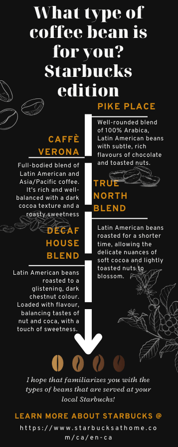
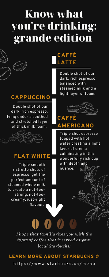
This infographic has practical value as it’s created for anyone wondering what Starbucks products contain; it’s well structured and organized, and contains large amounts of information that is easily comprehensible. I have also taken into account the use of white space as it promotes the readability of the content, reduces cognitive overload, and helps readers understand the content better by creating a sense of order and flow.
References:
Easelly: Infographic Design Tips & Tutorials. (2019, May 19). White Space in Infographic Design: Why It Matters [Video]. Youtube. https://www.youtube.com/watch?v=npt3ipuJJBU&ab_channel=Easelly%3AInfographicDesignTips%26Tutorials
Visme. (2017, June 30). How to Create an Infographic – Part 1: What Makes a Good Infographic? [Video]. Youtube. https://www.youtube.com/watch?v=nLxQAa5Sras&ab_channel=Visme
meiramarie says:
Canva is a pretty cool program and a good jumping-off point, but in a way it is limited. I loved the Starbucks infographic, if you told me that was made by a Starbucks executive, I would believe you 🙂
2023-03-23 — 10:36 pm